TASKTAG / CONSTRUCTION
Designing for the job site: the Tasktag mobile redesign.
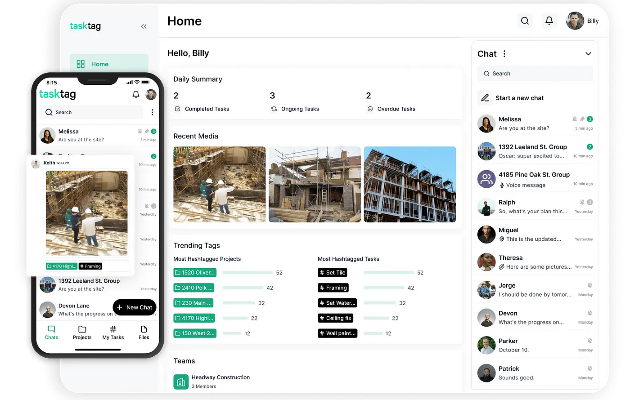
Tasktag is a crew and project management app for construction. I redesigned three core experiences, My Tasks, Activity and onboarding, so construction crews see what needs them first and can act in one tap.
Project details
In short
Three screens that answer: what needs me right now?
- of new tasks got done in September, up from 14%
- 25%+11 pts
- tasks completed in September, up from 74 in July
- 140+89%
- onboarding completion, up from 52% after the web tutorial shipped
- 68%+16 pts
- of people who see the new chat nudge complete it
- 87%New
Tasktag users are project owners and field crews. They check their phones between jobs, often one-handed and in a hurry, and many run several job sites at once. Every screen in this work answers one question for them: what needs me right now?
My Tasks
Live on mobile since August 2026. Tasks completed rose 89%, and the share of new tasks that got done went from 14% to 25%.
Onboarding
The first web onboarding is live, and completion rose from 52% to 68%. The update for the chat revamp is in the build queue.
Activity
Splits “needs a decision” from “for your information”, so owners can approve join requests right from the feed. Handed off and in the build queue.
My Tasks
Today’s work, grouped by job site.
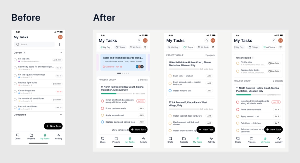
Goal: help crews know what to do today, at which site, without scrolling through everything they own. An audit of the old screen showed three gaps.
No sense of time
Overdue, next-month and undated tasks sat in one list and looked the same.
No sense of place
The job site was a tiny grey line under each task, yet crews plan their day by site.
Clutter at the top
A permanent search bar and a menu took space from the tasks themselves.
Key decisions. Each one came with a trade-off.
Three views: My Day, 7 Days, All Tasks
Matches how crews plan: today, this week, everything else. Trade-off: one tap to change scope, and All Tasks keeps the full list.
Group tasks by job site, with a progress bar
Crews think in sites, and “3/7 tasks done” gives site status at a glance. Trade-off: tasks across sites are no longer in one date order, so each row keeps its date chip.
Overdue spotlight card in My Day
The most urgent work is the first thing on screen. Trade-off: it’s shown only in My Day, so other views stay calm.
Priority in the task circle’s color
Adds a signal without adding a badge to every row. Trade-off: color alone is not enough, so overdue dates also turn red.
An Unscheduled group with a Due Date button
Undated tasks were getting lost; now they ask to be scheduled. Trade-off: one more section in All Tasks.
Search and filters moved to icons
Gives the space back to tasks. Trade-off: search is one tap away instead of always visible.
Tested and shipped
Three rounds of testing, then live in five weeks.
I tested the design in three rounds, each one closer to the real thing.
- V1, Figma frames. Layout, grouping and visual hierarchy.
- V2, Figma Sites prototype. Click-through of the three views.
- V3, coded prototype. Real scrolling, view switching and grouping, which static frames can’t show.
My Tasks went live on mobile in August 2026, about five weeks after the build started in July. It shipped the new tabs, list and hero card, the filter sheet, search and group-complete. One planned piece, the photo-before-completion prompt, was paused until web supports it too.
Primary KPI: share of new tasks completed. It went from 14% to 25%, which means crews are closing out work, not just logging it.
| Metric | July | September | Change |
|---|---|---|---|
| Share of new tasks completedPrimary | 14% | 25% | +11 pts |
| Tasks completedSupporting | 74 | 140 | +89% |
| Tasks completed per person who completesSupporting | 3.5 | 5.4 | +54% |
| People using searchSupporting | 14 | 47 | 3.4× |
| Monthly active users who complete a taskWatch | 7.5% | 7.0% | Flat |
Not tracked yet: which view people use (My Day, 7 Days or All Tasks) and time from opening the app to the first task. Both would show whether the time-based views are doing their job.
Activity
From a log of everything to a feed of decisions.
Goal: turn a log of everything that happened into a feed that tells owners what needs their answer.
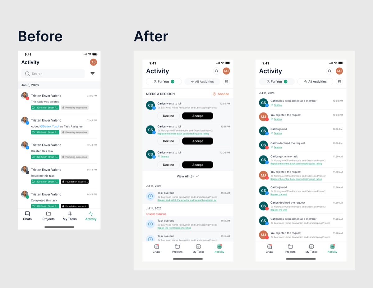
Everything weighed the same
Join requests that block a crew member sat between routine updates like “task restored”.
Hard to skim
Every entry repeated the person’s name, the action and two chips.
No way to act
Owners had to open each item to respond.
Key decisions.
A pinned Needs a Decision section
Requests that block someone come before updates that don’t. Trade-off: it pushes the timeline down, so extras fold behind View All.
Accept and Decline on the card
Owners can answer in one tap without leaving the feed. Trade-off: bigger cards for these items only.
Snooze
Owners can put off a decision without losing it. Trade-off: one more control to learn.
For You and All Activities tabs
Separates what concerns me from the full project log, with an unread count. Trade-off: two places to look, with For You as the default.
Repeated overdue alerts, grouped
“3 tasks overdue” replaces three separate entries. Trade-off: each task still sits in the group, one tap away.
Sentence-style entries with a status badge
“Carlos declined the request” reads at a glance, and the badge on the avatar shows the event type first. Trade-off: badges need a consistent icon set across event types.
Project, task and team names are green links that open the item directly. Notification dots on the bottom navigation show which tab has something new. This round had no prototype; it’s handed off for mobile and web.
Primary KPI after launch: time from a join request to the owner’s answer. It isn’t tracked today, so a decision event with its timestamp should ship with the build. The September baseline is what the redesign should move.
| Metric | September baseline | Goal |
|---|---|---|
| Time from join request to answerPrimary | Not tracked | Down |
| Share of requests answered from the feedSupporting | Not tracked | Up |
| People viewing the activity logSupporting | 107 (29% of MAU) | Up |
| Views per personSupporting | 3.0 | Steady or up |
| Team invites acceptedOutcome | 4 | Up |
| People using activity filtersWatch | 1 | Not a goal |
Onboarding
Re-anchoring the tutorial after the chat revamp.
Goal: keep the guided tutorial working after the chat revamp, on web and mobile, without rebuilding what still worked. I redesigned 16 of the 25 flows.
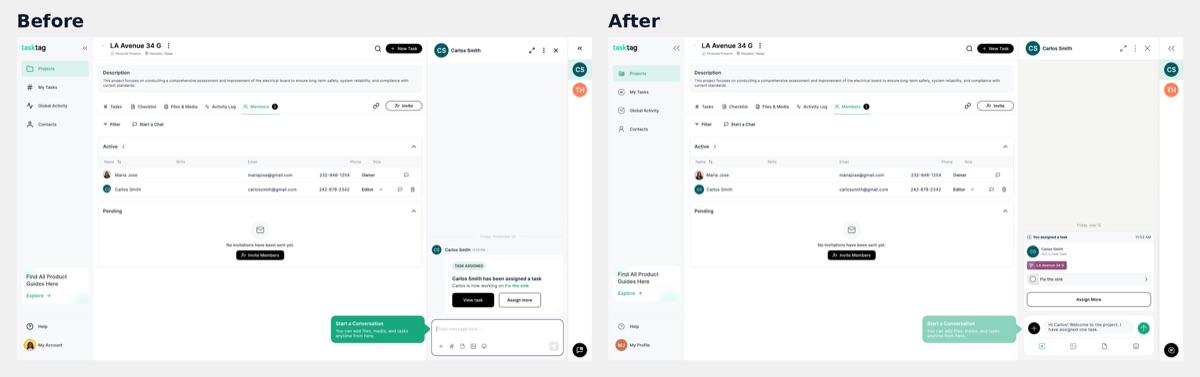
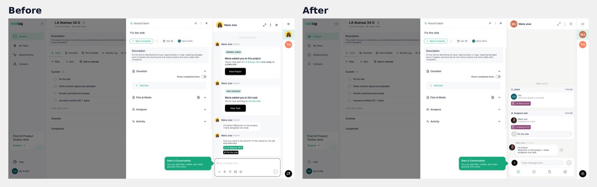
Tasktag’s onboarding is a guided tutorial: tooltips and coachmarks point at real parts of the app. The chat revamp changed chat items, the chat input and image and document attachments. That moved the tooltip anchors, so the tutorial pointed at things that had moved or no longer existed.
Maria Jose, project owner
Sets up a project, creates tasks, invites crew, assigns work and uses chat, photos and tags.
Carlos, invited crew member
Joins from an invite, learns his task, then chats, attaches photos and uses tags.
- Maria Jose, web: 4 of 7 flows redesigned. Invite crew nudge, first chat after member joins, photo and tag request nudge, first tag pill click.
- Carlos, web: 4 of 5. Understanding the task, first chat, first photo and tag, first tag pill click.
- Maria Jose, mobile: 4 of 8. Assign task after member joins, first chat after member joins, photo and tag request nudge, first tag pill tap.
- Carlos, mobile: 4 of 5. Understanding the task, first chat, first photo and tag, first tag pill tap.
The flows before chat, such as the welcome greeting, project and task creation, and the invite landing, stayed as they were. Web also keeps an edge case where Maria Jose assigns a task while creating it.
Redesign only the flows the new chat touched
16 flows had broken anchors; the 9 flows before chat did not. Trade-off: the two rounds now live side by side in Figma, marked [Updated].
Keep the tooltip copy and re-anchor it
Users learn the same steps in the same words; only the position moves. Trade-off: copy improvements wait for a later round.
Same steps across web and mobile
One mental model, whichever device a crew member starts on. Trade-off: some tooltips sit in different spots per platform.
Keep the existing rules
Progress only moves forward, each tooltip shows once, and the chat-input tooltip fades 2 seconds after typing starts. Trade-off: no replay option for users who skip.
Onboarding results
One tooltip re-anchored, and completion up to 68%.
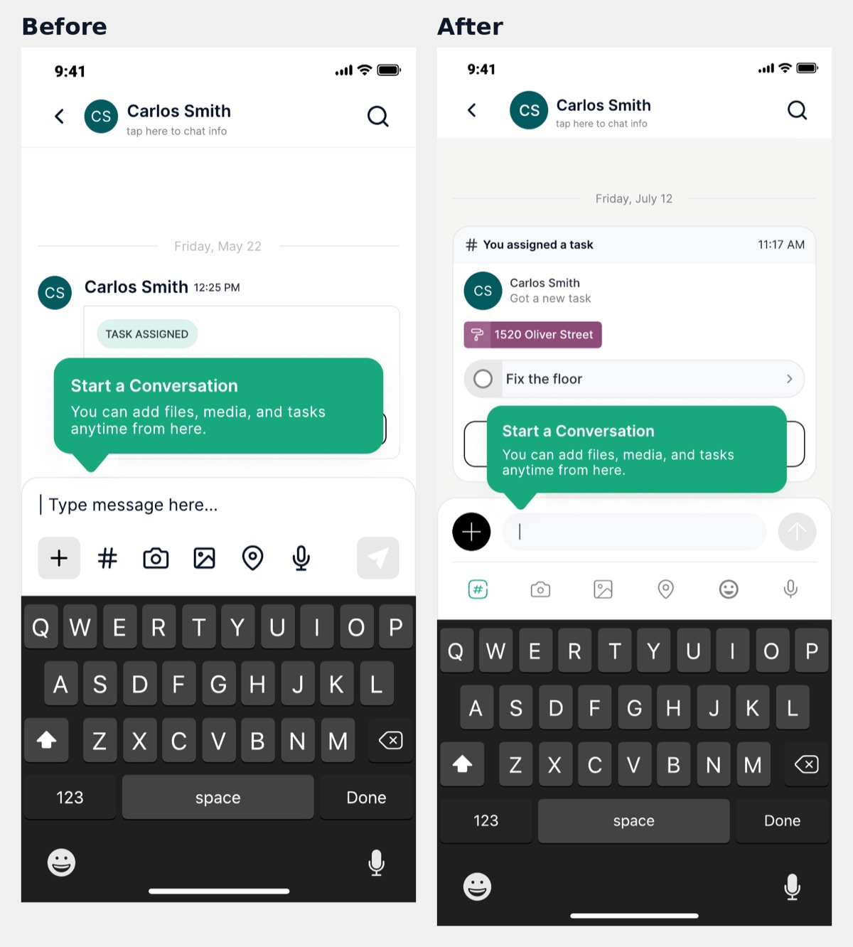
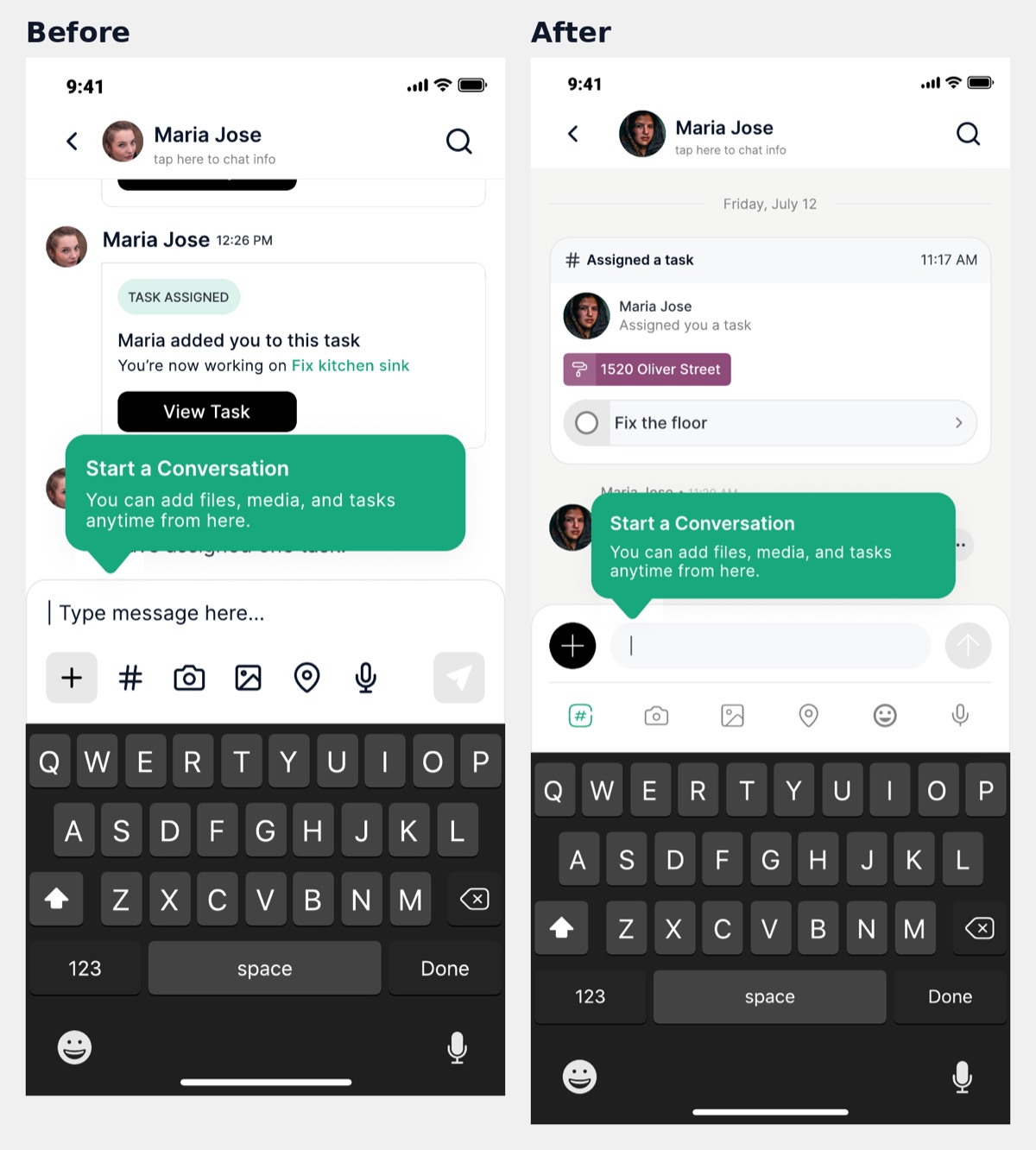
The Start a Conversation tooltip shows the change on every platform. In the new chat, task cards became compact activity cards and the input moved to a single row, so the tooltip was re-anchored to the new input.
Primary KPI: onboarding completion (finished ÷ started). It rose from 26% in May to 52% in July, and to 68% in September after the first web tutorial shipped.
| Metric | July | September | Change |
|---|---|---|---|
| Onboarding completionPrimary | 52% | 68% | +16 pts |
| People creating a projectActivation | 42 | 80 | +90% |
| Teams createdActivation | 14 | 27 | +93% |
| People sending a chat messageActivation | 44 | 121 | 2.8× |
| App intro completionWatch | 85% | 87% | Steady |
| Metric | Completed | Dismissed | Completion |
|---|---|---|---|
| Chat nudge | 54 | 8 | 87% |
| Invite-crew nudge | 15 | 35 | 30% |
Status and impact
Where each project stands, and how it supports revenue.
My Tasks (mobile)
Live since August 2026.
Onboarding, first round
Live on web; mobile in development.
Onboarding, chat-revamp update
In the build queue; step tracking in code review.
Activity (mobile and web)
Handed off; 2 backend tickets done.
New users grew quickly over the same period, with 187 sign-ups and 7 plan upgrades from May to September 2026.
- May60 upgrades
- Jun382 upgrades
- Jul181 upgrade
- Aug373 upgrades
- Sep881 upgrade
Sign-ups more than doubled from August to September. That growth comes from acquisition, so I don’t credit it to these designs; what they decide is what new users find once they arrive. These numbers show change after launch, not proof of cause, and the counts are still small. Onboarding events cover web and mobile together.
Tasktag earns money when teams upgrade to a paid plan. Each project strengthens a different step on the way there.
A new user gets started
Onboarding walks owners through a first project, a first invite and a first chat.
The crew joins
Activity lets owners approve join requests in one tap, so crews aren’t left waiting.
The team comes back daily
My Tasks gives each crew member a reason to open the app every morning.
The team upgrades
Teams that rely on Tasktag every day are the ones that pay for it.
Seven upgrades in five months is too few to tie any single design to revenue. Sign-ups more than doubled in September, so getting new users to their first task and first teammate is now the step that matters most. That is the job Activity and onboarding are built for.
What I learned
Ranking beats showing everything.
Deciding what comes first matters most
Both My Tasks and Activity got better by ranking, not by adding.
Grouping is a design decision
By site, by decision and by overdue status, each grouping cut how much users have to scan.
Redesigns ripple
The chat revamp broke 16 tutorial flows on two platforms. I now check tutorial anchors before a redesign starts.
Prototype in code early
The V3 prototype exposed scroll and grouping issues the static frames hid.